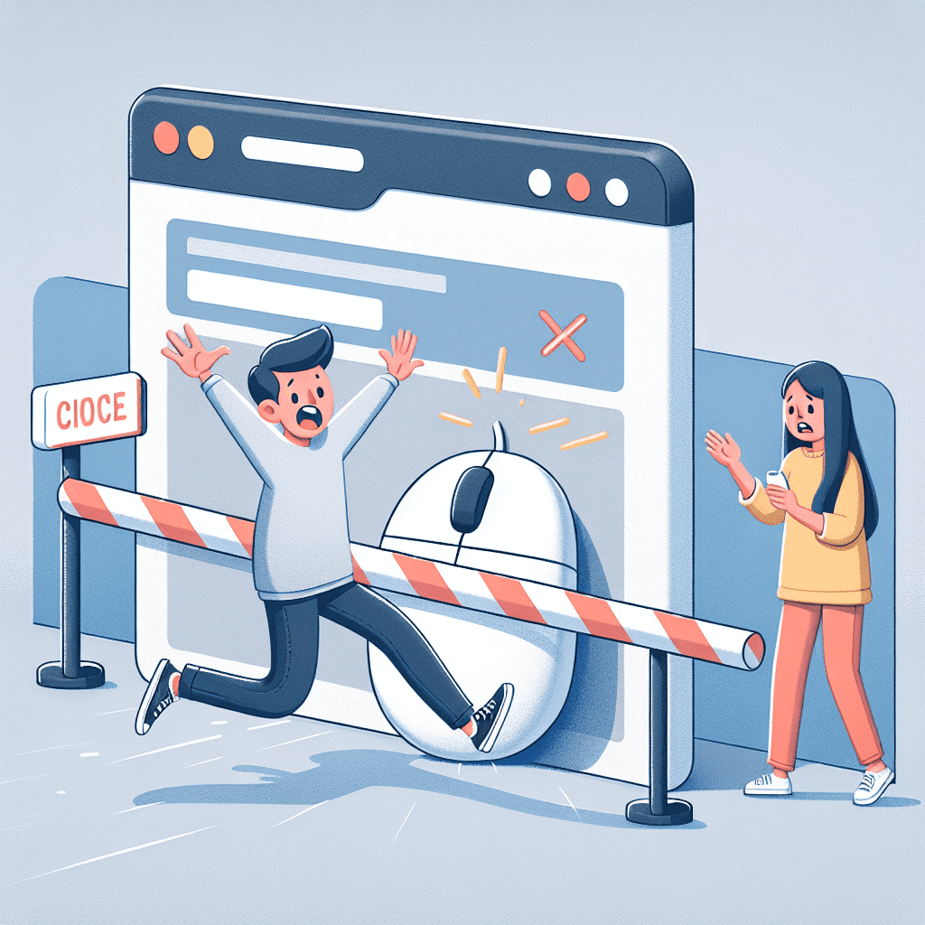
For something that’s supposed to be “just a few clicks,” online booking sure has a lot of ways to go sideways. You’d think with all the tech we’ve got, people would be booking everything from massages to moon landings without hesitation. But nope. Plenty of us still bail halfway through, often with a vague sense of frustration and a browser full of abandoned tabs. So, what’s the holdup?
Let’s walk through the actual reasons people hesitate to book online, and what smart businesses can do to stop losing sales to avoidable nonsense.
First up: trust. Or the lack of it.
If your website looks like it was last updated when flip phones were cool, people are going to bounce. According to Edelman, 67% of consumers might give you a shot based on reputation; but if they don’t trust your brand, they’re not coming back. And trust isn’t just about having a familiar logo. It’s about clean design, secure connections (yes, HTTPS still matters), visible reviews, and those little trust badges that reassure people you’re not running a phishing scam from your cousin’s basement.
But even if your site looks polished, the booking process itself can be its own kind of obstacle course.
The Baymard Institute found that 17% of users abandon checkout because it’s just too complicated. Think about that. Nearly one in five people give up because the process is annoying. Long forms, forced account creation, no autofill—it’s like trying to RSVP to a party and being asked for your blood type. Mobile users feel this even more acutely. Tiny screens and clunky fields don’t mix well.
And then there’s the classic bait-and-switch: hidden fees.
You’re cruising through the booking, everything looks good, and then—bam—a “processing fee” appears out of nowhere. Or a “service charge” that wasn’t mentioned upfront. According to Baymard again, 48% of users abandon their cart when unexpected costs pop up. That’s not a small number. If your pricing isn’t clear from the start, people feel tricked; and tricked people don’t convert.
Even when the price is right, payment flexibility matters.
Checkout.com found that 56% of people will walk away if their preferred payment method isn’t available. That includes digital wallets,
buy-now-pay-later options, and yes, even crypto for those few who still believe Bitcoin is going to buy them a beach house. The point is, if your checkout only accepts one or two methods, you’re narrowing your audience for no good reason.
Now let’s talk about mobile. Or rather, the mobile mess.
Despite mobile making up over 58% of global web traffic, a lot of booking flows still feel like they were designed on a desktop and then squeezed onto a phone as an afterthought. Slow load times, buttons that are too small to tap without zooming, weird scrolling
behavior—it’s all friction; and friction kills momentum.
Source: Statista
But even when everything works technically, people still hesitate if there’s no reason to act now.
Urgency matters. Scarcity works. It’s not manipulative—it’s psychology. As Cialdini explains in his work on influence, people are more likely to act when they think they might miss out. If your site doesn’t highlight limited availability, a ticking clock, or even a modest discount for booking today, users might just wander off, planning to come back later. Spoiler: they probably won’t.
And when users get stuck? They want help. Fast.
According to Forrester, 44% of online consumers say having their questions answered by a real person is one of the most important things during checkout. That doesn’t mean a chatbot that replies with “I don’t understand” every time you ask something slightly human. It means live chat, helpful FAQs, and ideally, someone who can jump in when the user’s halfway through booking and about to rage-quit.
Another big one: cancellation anxiety.
Post-COVID, people are more cautious. They want to know they can cancel or reschedule without a Kafkaesque nightmare. Deloitte found that 57% of travelers prioritize flexible booking options. That sentiment isn’t limited to flights and hotels. Events, appointments, even classes—if your cancellation policy is hidden, vague, or punitive, you’re creating unnecessary friction.
Now, let’s talk about the paradox of choice.
Too many options can backfire. That Columbia University study on choice overload? It showed that people were ten times more likely to buy jam when offered six flavors instead of twenty-four. The same applies to bookings. If your site throws ten packages, six add-ons, and a dozen calendar slots at users all at once, they’ll freeze. Simplify. Guide. Don’t overwhelm.
Last but definitely not least: personalization.
Generic booking flows are forgettable. Worse, they’re easy to
abandon. McKinsey found that companies who personalize well see 40% more revenue from those efforts. That’s not a rounding error. Whether it’s remembering a user’s last visit, suggesting relevant times, or tailoring offers based on behavior, personalization makes users feel seen; and seen users are more likely to convert.
So where does that leave us?
You’re not just fixing a checkout. You’re removing friction from a decision.
Booking online should be simple, fast, and trustworthy. But it so often isn’t. The good news? Most of these problems are fixable. With a little UX sense, some behavioral insight, and a willingness to stop annoying your users, you can remove the roadblocks and watch your conversions climb. Or you can keep watching people vanish halfway through checkout like it’s a magic trick. Your call.
That’s one more tool in the belt.
We’ll be back soon with more you can use.
Until then, keep building.
– Perfect Sites Blog

